

- Case Study • Education
Modernizing language training and streamlining course registration.
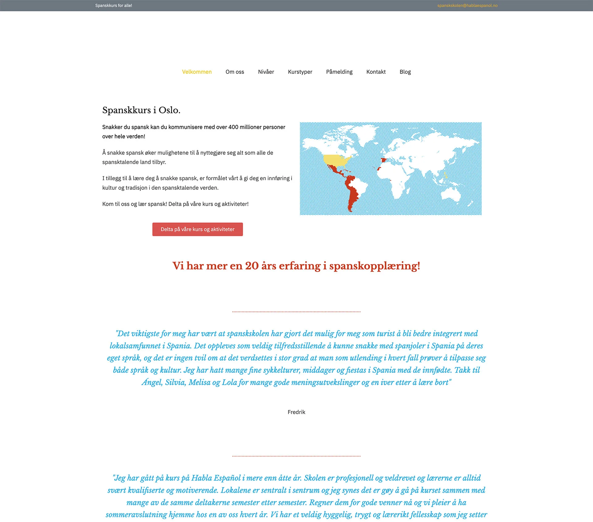
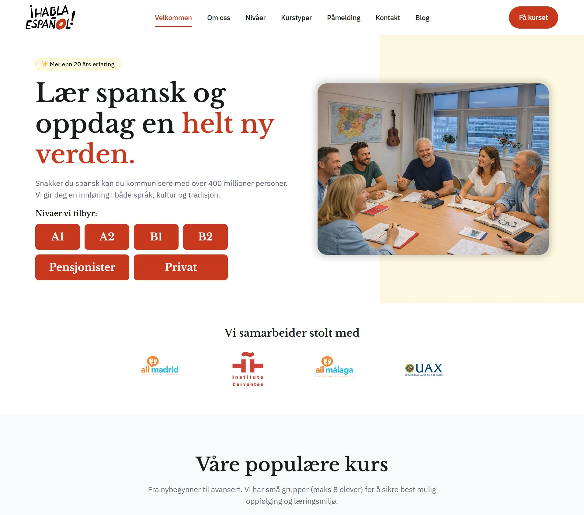
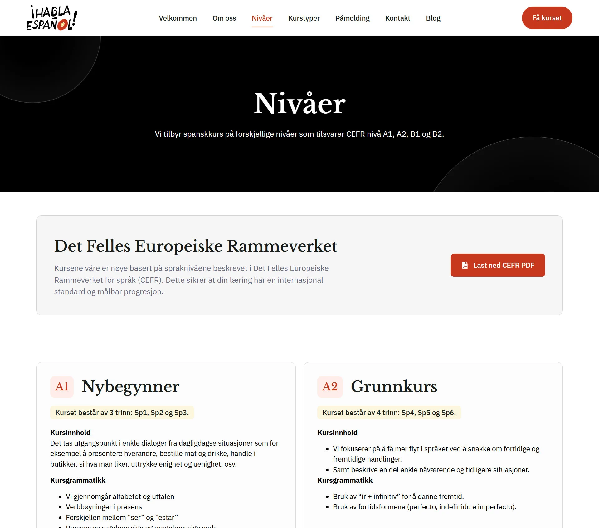
A fragmented system with a high degree of friction.
Comprehensive order form:
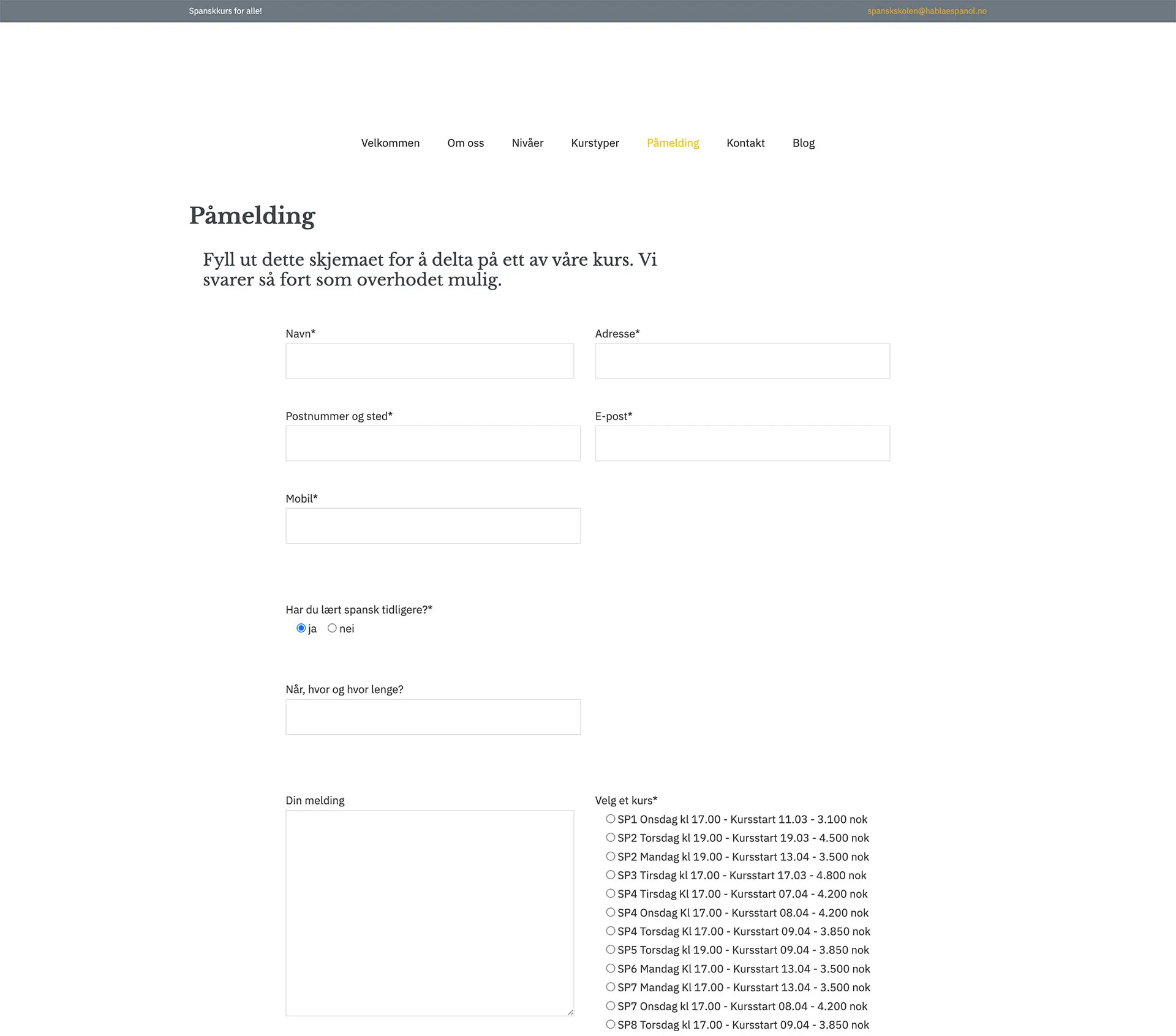
The “Registration” page consisted of a huge, intimidating list of checkboxes for each individual course and time slot. It was tedious and easily led to users abandoning the process.
Fragmented course search:
Navigating between the levels (A1, A2, B1) and finding the right schedule was a maze of dense, tedious text lists that required many clicks.
Outdated visual identity:
The old design seemed academic and stiff, and failed to reflect the lively, welcoming, and social atmosphere of learning Spanish.
The strategic shift
UX Upgrade
Intuitive Discovery Course
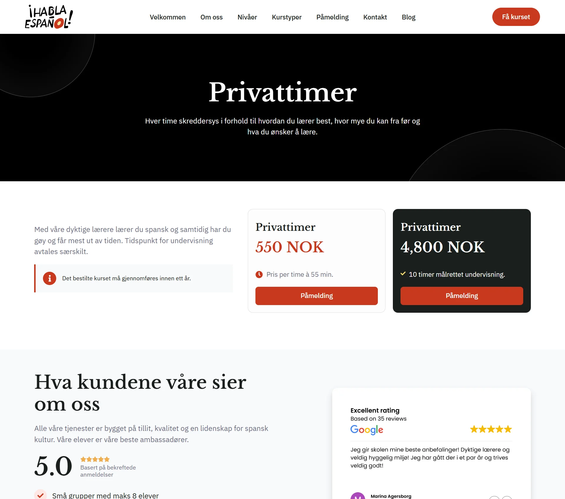
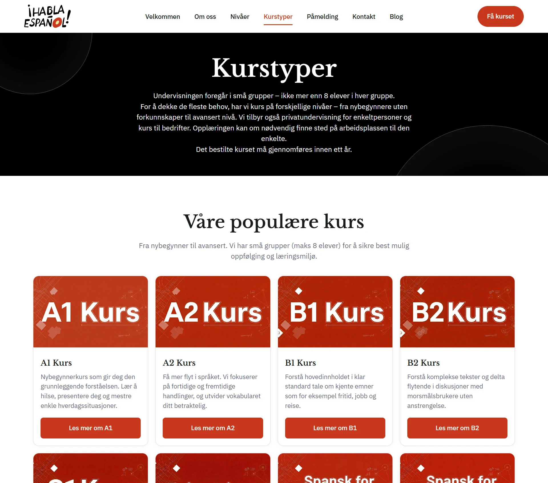
We have replaced the static, text-heavy course pages with a dynamic and visual user experience. Students can now easily filter by CEFR level (A1 to C1), format (online or in-person), and schedule using modern course cards that clearly display price, duration, and start dates.
Fewer clicks to find a course.
Conversion
Repair of the registration engine
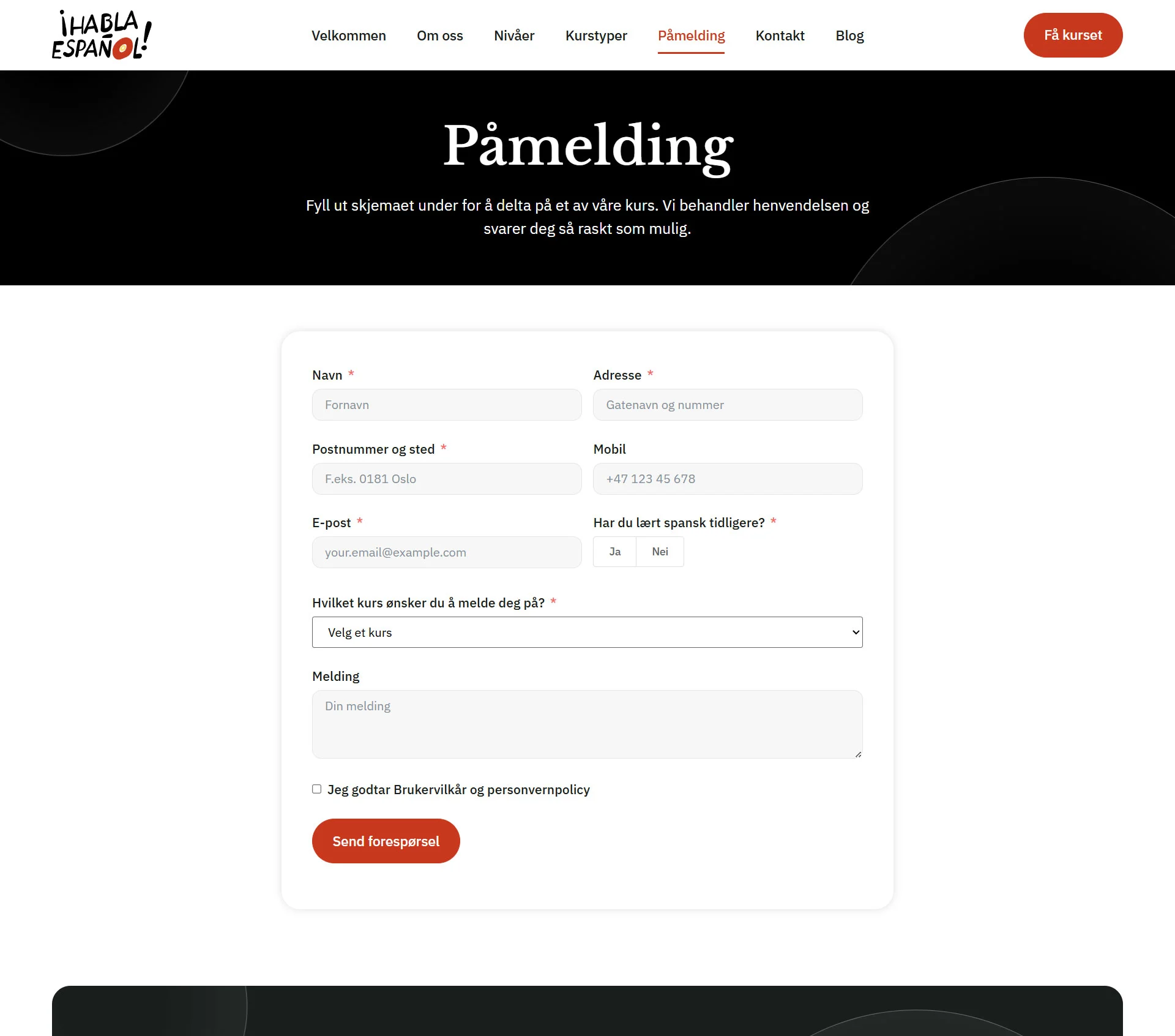
Frictionless forms:
Simple data entry that works flawlessly on mobile devices.
Automated organization:
Backend improvements to ensure that the administration immediately receives clean and sorted registration data.